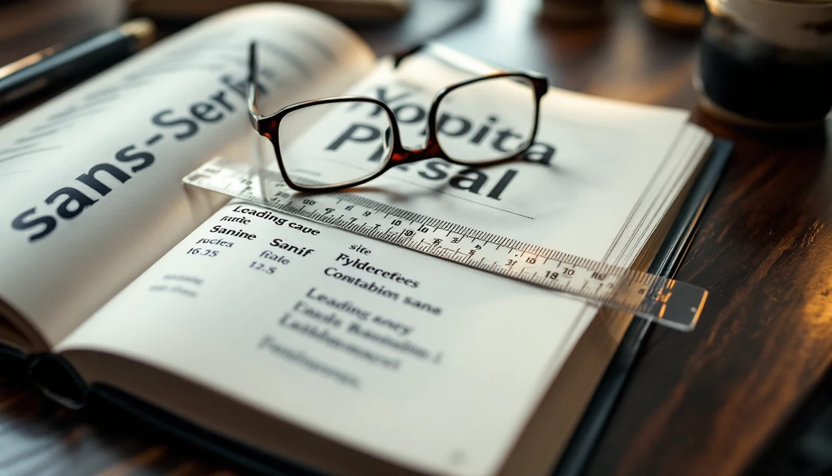
Image description: A typography specimen book showing different sans-serif typefaces with a leading-ruler and reading glasses on top — the visual marker for inclusive typography.
Reading Time: 9 minutes
Type is the layer of a digital product most readers never consciously notice — until it fails them. For a dyslexic reader, a low-vision reader, or a reader with attention-deficit traits, the difference between a comfortable page and an exhausting one is often measured in millimetres of leading, hundredths of an em of letter-spacing, and a font-size value set in the stylesheet six months ago and never revisited. Inclusive typography is the discipline of choosing those values on the basis of what the readability evidence actually supports, rather than what looks “designerly” in the cover shot of a portfolio.
This primer maps the field as it stands in 2026. It covers font choice — including the well-known but evidence-thin claim around OpenDyslexic, and the more defensible alternatives in Atkinson Hyperlegible and the Tiresias family. It walks through the four numeric levers locked in by WCAG 2.2 Success Criterion 1.4.12 Text Spacing: line height, letter-spacing, word-spacing, and paragraph spacing. And it closes on the underrated levers that the research keeps pointing back to — line length, alignment, and a sane minimum font-size. What works for low-vision readers, the evidence shows, overlaps significantly with what works for dyslexic readers and for readers with ADHD-pattern attention.
Font choice: what the research says (and does not say)
There is a strong popular belief that a “dyslexia font” exists and that switching to one will materially improve reading for dyslexic users. The two faces most often named are OpenDyslexic (released as a free open-source typeface in 2011) and Dyslexie (a commercial face designed by Christian Boer in 2008). Both share a distinctive design strategy: weighted bottoms on each glyph to “anchor” letters to the baseline, exaggerated openings on letters like c and e, and increased differentiation between mirror-image pairs (b/d, p/q, n/u). The visual logic is intuitive and the marketing has been effective. The evidence, however, is thinner than the marketing suggests.
The most-cited empirical study — Rello and Baeza-Yates (2013) — found no significant reading-speed advantage for dyslexic readers using OpenDyslexic compared with conventional sans-serif faces. A follow-up by Wery and Diliberto (2017) in Annals of Dyslexia tested children with dyslexia reading in Times New Roman, Arial, and OpenDyslexic and found no consistent gain for the dyslexia-specific face. A 2018 review by the British Dyslexia Association concluded that no single typeface had been demonstrated to outperform a well-designed, plain sans-serif for dyslexic readers across reading speed, accuracy, and comprehension at a level that justified prescribing it as a remediation tool. The 2024 follow-up commentary by the same association reaffirmed the position.
What the same research base does support is that type design choices matter, just not in the way the dyslexia-font marketing claims. The features that improve readability for dyslexic readers are the same features that improve readability for low-vision readers and for readers reading in sub-optimal lighting:
- Generous x-height — the height of the lowercase body relative to the cap height. A larger x-height makes individual glyphs easier to identify at smaller display sizes.
- Unambiguous letterforms — clear distinction between the lowercase l, uppercase I, and numeral 1; between zero and capital O; between c, e, and o; and between mirror pairs b/d and p/q.
- Open apertures — the gaps in letters like c, e, a, and s should be wide open, not closed-up. Closed apertures collapse at small sizes and in low contrast.
- Even stroke weight — high-contrast typefaces (thick verticals, thin horizontals) reduce legibility at small sizes for low-vision readers; an even or moderately-contrasted stroke is more robust.
- Generous spacing as drawn into the font — some faces ship with tight default metrics that fight the reader before any CSS is applied.
The two faces that are most defensible on the evidence are Atkinson Hyperlegible, designed and released by the Braille Institute in 2019 specifically for low-vision readers, and the Tiresias family, originally designed at the RNIB for subtitle and screen use in the 1990s and still in use across UK broadcast accessibility. Atkinson Hyperlegible is free, includes a substantial language coverage, and is shipped as a default option in several operating systems’ accessibility settings. Its design choices — exaggerated differentiation between 0 and O, between 1 and I and l, between c and e — were tested with low-vision readers during development, and the same choices help dyslexic readers because the underlying confusion patterns overlap.
The honest summary is therefore: do not promise that a dyslexia-specific font will fix reading for a dyslexic reader. Choose a well-designed sans-serif with a generous x-height, clear letter differentiation, open apertures, and even stroke weight. Atkinson Hyperlegible is a strong default. So is Tiresias for screen-only contexts. So, for that matter, is a well-set version of Verdana, Tahoma, Trebuchet MS, or the system UI font on each operating system. The evidence does not say “use this one face”; it says “do not use a high-contrast, low-x-height, tight-aperture display face for body text.”
Line height: the 1.5x floor
If font choice is the most-discussed lever in inclusive typography, line height is the most-underused. WCAG 2.2 Success Criterion 1.4.12 Text Spacing makes the floor explicit: when a user applies a stylesheet override to increase text spacing, no content or functionality should be lost. The four constraints in 1.4.12 are line height of at least 1.5 times the font size; spacing following paragraphs of at least 2 times the font size; letter-spacing of at least 0.12 times the font size; and word-spacing of at least 0.16 times the font size. These are the minimum values the page must accommodate without breaking. They are not, however, the only values worth knowing — they are the lower bound of acceptable.
The mechanism by which line height helps readers is well-studied. When lines are set tight — leading of 1.0 or 1.1 — the descenders of one line crowd the ascenders of the next, creating visual interference that the eye must resolve before it can identify glyph shapes. For a typically-reading adult this resolution is automatic. For a dyslexic reader, who already devotes more cognitive bandwidth to letter identification and word segmentation, the additional cost of resolving inter-line interference is non-trivial. The same is true for a low-vision reader whose effective character size after magnification is smaller than the average. Adequate line height isolates each line as its own horizontal band, which reduces the eye’s tendency to skip lines or re-read the same line — a documented difficulty for dyslexic readers.
The research base recommends a leading of approximately 1.4 to 1.6 for body text on screen — the precise value depends on font, size, and line length. For long-form reading, leading of 1.5 is a safe default; for shorter text blocks at slightly larger sizes, 1.4 can read well; for narrow columns at small sizes, 1.6 to 1.7 is sometimes warranted. The WCAG floor of 1.5 sits at the lower end of this band, which is why it is a floor, not a target. If a page sets line-height: 1.5 it complies with 1.4.12. If a page sets line-height: 1.6 it complies and reads more comfortably for the readers the criterion was written for.
Letter spacing and word spacing
The two spacing levers inside the word — letter-spacing (tracking) and word-spacing — are the levers most often left at zero by default. Most well-designed fonts ship with metrics that work at the size they were designed for, which on screen tends to be a body size of 14–16 px. The WCAG 1.4.12 minima ask that the page accommodate letter-spacing of 0.12em and word-spacing of 0.16em without breaking. Authors are not obliged to set these values; they are obliged not to break when a user agent applies them.
The mechanism for letter-spacing is similar to that of line height: a small amount of tracking — on the order of 0.02em to 0.05em for body text in a sans-serif — reduces the perceptual crowding between adjacent glyphs. The effect is most pronounced for low-vision readers reading magnified text, where letters that touch or nearly touch can merge into a single visual cluster, and for dyslexic readers, for whom letter-identification is the rate-limiting step. The same modest tracking helps in screen environments where sub-pixel rendering is less accurate (high-resolution displays running at non-integer scale factors, for example).
Word-spacing is the often-overlooked sibling. In a justified text block (which inclusive typography should avoid — see below), word-spaces stretch and compress unpredictably as the renderer balances line widths. In a left-aligned block, the word-space is constant. Word-spacing of approximately 0.16em — roughly the WCAG floor when applied as a positive offset — improves word segmentation for dyslexic readers, which is a documented bottleneck. The same value helps text-to-speech preview reading and improves the rhythm of finger-tracking for tactile-magnifier users.
The practical recipe for body text on a content-rich site, in CSS terms, looks like this:
- font-size: at least 16px (1rem with a 16px root), preferably 17–18px for long-form prose
- line-height: 1.5 minimum, 1.6 preferred for body
- letter-spacing: 0 to 0.02em for most sans-serifs; up to 0.05em in slab faces or at small sizes
- word-spacing: 0 by default, with the page tested to remain functional at user-applied 0.16em
Paragraph spacing
The fourth value in WCAG 1.4.12 is paragraph spacing: at least 2 times the font size between paragraphs when a user applies the override. The mechanism is visual chunking. The eye reads in saccades — fast jumps between fixation points — and a clearly-demarcated paragraph end lets the eye reset without overshooting into the next paragraph. For a reader with attention-deficit traits, a clear paragraph break is a built-in pause; for a low-vision reader using magnification, it is a structural landmark that survives the loss of horizontal context that magnification imposes.
In practice this means avoiding the common visual-design choice of running paragraphs together with only a tab indent for separation. Indent-only paragraph separation reads well in print at print font sizes and in newspaper columns with strong inter-column rules; it does not survive translation to a 320-wide phone screen at 18px body size. A clear blank line — approximately equal to one line height, which sits comfortably above the 2x font-size floor — is the safer default.
Underrated levers: line length, alignment, and minimum size
Three levers that do not appear in WCAG 1.4.12 but appear repeatedly in the readability literature are line length, text alignment, and minimum font-size. Each of them is invisible until you measure it; each of them has a meaningful effect on dyslexic and low-vision readers.
Line length is the horizontal width of a column of text, conventionally measured in characters per line (CPL). Research from Bringhurst, Tinker, and successive screen-readability studies converges on a comfortable band of 50–75 characters per line for print and 60–80 for screen. Below 45 CPL the eye saccades too often and reading rhythm fragments; above 90 CPL the eye loses track of which line it is on at the right-hand return sweep — a documented difficulty for dyslexic readers and for low-vision readers using magnification. For a 16–18px body size at the recommended line height, this band typically translates to a column of approximately 32–42em (around 500–700 px on a desktop layout). The fact that most blog and editorial sites still set content columns at 800–900 px wide at 16px body — yielding 95–110 CPL — is a meaningful inclusive-design failure.
Text alignment is the second underrated lever. Body text should be set left-aligned in left-to-right scripts (or right-aligned in right-to-left scripts), with a ragged opposite edge. Justified text — where the renderer adjusts inter-word spacing to make both edges flush — creates uneven and unpredictable word-spaces. The variability disrupts word-segmentation for dyslexic readers and produces visible “rivers” of white space running vertically through the column, which low-vision readers report as visually intrusive. Justified text is a print-typography convention that depends on tight CSS or hand-set adjustment of letter-spacing and hyphenation. In modern web typography, the cost is rarely justified. Left-aligned, ragged-right text is the inclusive default.
Minimum font-size is the third. The web has converged, through accident more than intent, on a body size of 16px (1rem with default root sizing). That value is the floor — readers with low vision routinely zoom to 200% or higher, and a 16px floor permits that without the page collapsing. Setting body text smaller than 16px — 13px, 14px, even the much-favoured “elegant” 15px — pushes magnified reading past the 400% reflow ceiling that WCAG 1.4.10 Reflow defines, and it puts unmagnified reading below the comfort threshold for most adults over 40. The body should be 16px minimum, 17–18px preferred. Captions, footnotes, and metadata can sit at 14–15px because their function is supplementary. The body cannot.
What the research actually says
Synthesised across the readability literature of the last two decades — the British Dyslexia Association’s style-guide updates, the Atkinson Hyperlegible design rationale published by the Braille Institute, the W3C Working Group Notes that accompany WCAG 1.4.12, and the academic strand running from Tinker through Beier and Larson to Rello — three observations recur.
First, there is no single “dyslexia font” that has been shown to materially improve reading for dyslexic users in controlled trials. The dyslexia-specific faces released over the last fifteen years have not outperformed well-designed plain sans-serifs in head-to-head testing. The marketing has run ahead of the evidence.
Second, the typographic choices that demonstrably help dyslexic readers also help low-vision readers and readers with attention-pattern difficulties. The overlap is not coincidental — it reflects the fact that all three reader groups depend on the same low-level mechanisms (letter identification, word segmentation, line tracking) being made as cheap as possible. A page that is generous in line height, modest in letter-spacing, comfortable in line length, and left-aligned is a page that reads better for everyone, with the effect concentrated at the long tail of the reader distribution.
Third, the WCAG 1.4.12 floor is a floor. A page that meets it is compliant; a page that exceeds it — 1.6 line height, 0.03em tracking, 16-18px body, 65 CPL columns, left-aligned with paragraph breaks of one full line — reads visibly better for the readers the criterion is designed to protect, and reads no worse for everyone else.
What to take away
Inclusive typography is not exotic and it is not expensive. It is a matter of choosing a well-designed sans-serif, setting body text at 16px minimum with line height of 1.5 or more, leaving letter-spacing close to zero and accepting up to 0.05em where the font calls for it, holding line length in the 60–80 character band, and setting text left-aligned rather than justified. None of those choices require a new font licence, a redesign, or a procurement cycle. They require a CSS audit and the willingness to revisit the typography variables that were set on day one of the project and never reviewed.
The dyslexia-font question is a useful diagnostic of where a design organisation stands on the evidence. An organisation that has rolled out OpenDyslexic as a “dyslexia accessibility feature” has prioritised the appearance of action over the readability literature. An organisation that has audited its body type for x-height, aperture, and stroke contrast, and that has standardised on Atkinson Hyperlegible or a comparably well-designed system face for long-form content, has done the harder, less photogenic, more durable work. The next article in this strand looks at the same problem from the other side: how user-applied stylesheet overrides and reader-mode tooling interact with the typography decisions a site author has already made.