About · Brand assets
Logos, lockups, and palette — all on one page.
For journalists, partners, conference organisers, and anyone else co-presenting Disability World. Every file below is hosted on this site at a stable URL; you can hot-link to it from a partner site if that's easier than downloading. SVG is the primary format; PNG variants are supplied for raster-only contexts.
The mark
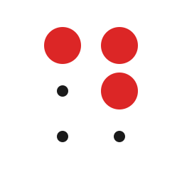
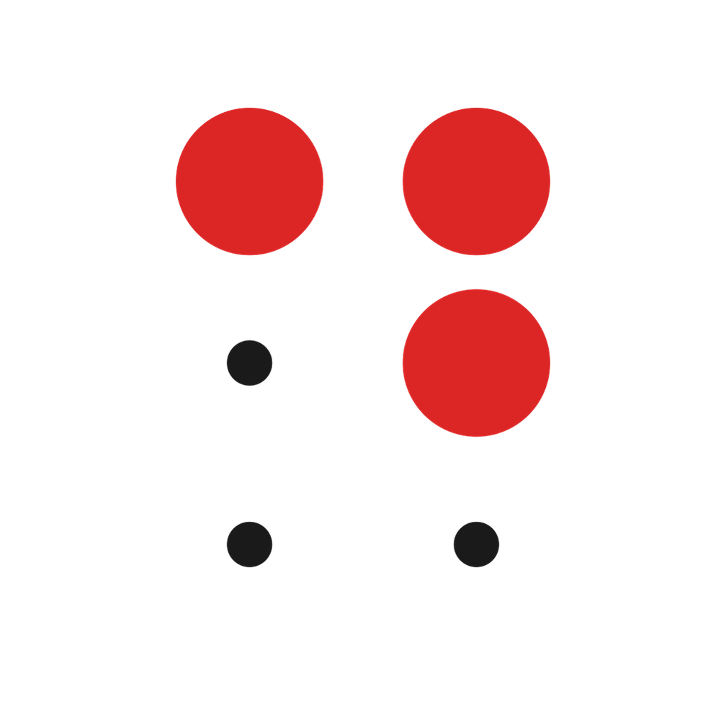
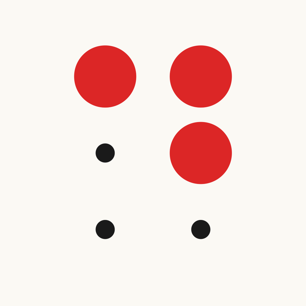
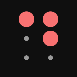
The Braille cell for the letter D — dots 1, 4, and 5 — rendered in our accent red, with tiny ink anchors at the three empty positions so the cell shape reads at any size.
-
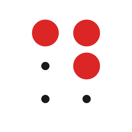
Primary mark — transparent
For use on white or light backgrounds. SVG scales infinitely; PNGs supplied for raster-only contexts (slide decks, email signatures, video lower-thirds).
-
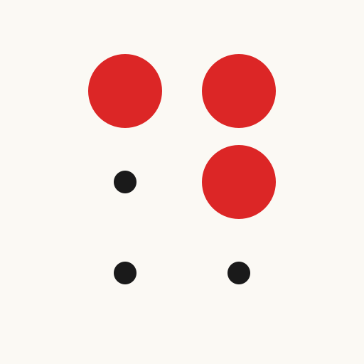
Primary mark — on cream
For use against the site's cream surface (#fbf9f4) or any near-white tinted background.
-
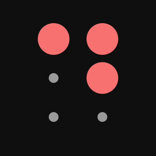
Inverse mark — on dark
For use against dark backgrounds. Red lightens to #f87171 to hold ~5:1 contrast; the empty-cell anchors flip to muted off-white.
Lockups
Mark plus wordmark, pre-aligned. Use these in headers, sponsor blocks, partner walls, and end-card credits. Never re-typeset the wordmark; use the supplied file so the spacing stays consistent.
-
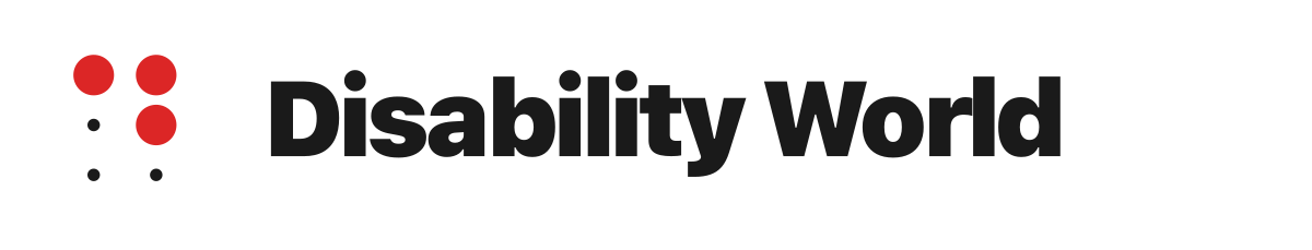
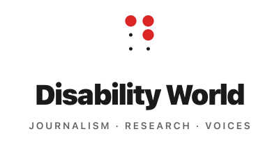
Horizontal lockup — mark + wordmark
Use this in headers, sponsor blocks, masthead-style citations, and conference programmes where horizontal space is available.
-

Stacked lockup — mark above wordmark
Use this when vertical space is tighter or when the lockup needs to sit in a square slot — partner walls, sponsor grids, end-card credits.
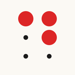
Social card
The default Open Graph image; what link previews look like when our URLs are shared on X, LinkedIn, Slack, or Facebook.
-
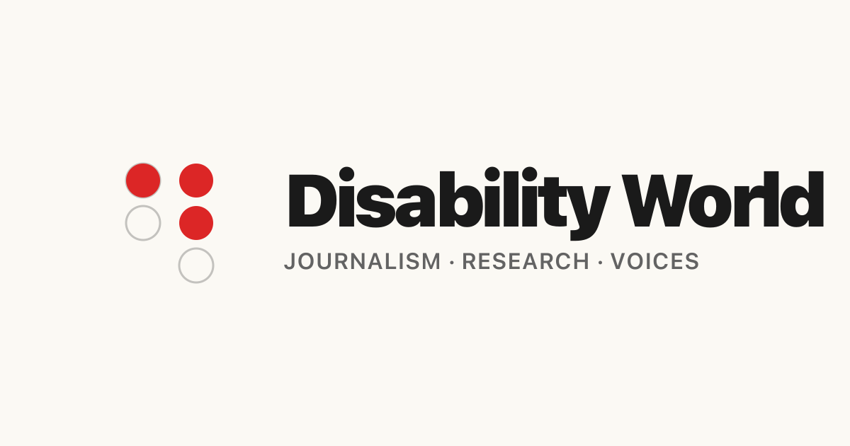
Open Graph / social card
The 1200×630 card that renders when someone shares any disabilityworld.org URL on social platforms (X, LinkedIn, Slack, Facebook, etc.). The site auto-serves this; the asset is here for partners who want to embed the same card in their own communications.
Colour palette
Six tokens, used consistently across the site, our editorial graphics, and any co-branded material.
-
Ink
#1a1a1aPrimary text, mark dots
-
Cream
#fbf9f4Site background, brand-asset backgrounds
-
Accent red
#dc2626Brand mark (light bg), pull-quotes, accent lines
-
Accent red — dark mode
#f87171Brand mark on dark backgrounds (~5:1 contrast)
-
Muted ink
#636363Meta text, taglines, secondary captions
-
Border
#e5e5e5Card borders, dividers
Usage guidelines
Short version: don't redraw the mark, don't restyle the wordmark, don't change the red.
Do
- Use the supplied SVG whenever possible — it scales without loss.
- Keep at least one mark-width of clear space around the logo on all sides.
- Use the inverse-on-dark variant whenever the background is darker than #555.
- Minimum size: 24 px tall for the mark, 120 px wide for the horizontal lockup. Below those sizes the Braille cell pattern stops reading.
- Pair with the system-font stack (or any neutral sans-serif) when text needs to sit next to the wordmark.
Don't
- Don't recolour the red dots — the accent colour is a brand token. (#dc2626 on light, #f87171 on dark.)
- Don't add effects (drop shadows, outlines, glows). The mark is flat by design.
- Don't re-typeset the wordmark or substitute a different typeface — use the supplied lockup SVG/PNG.
- Don't rotate, shear, or distort. The Braille cell only reads in its canonical 2-column-by-3-row layout.
- Don't crop the mark to one or two dots; the cell needs all three filled positions to register as the letter D.
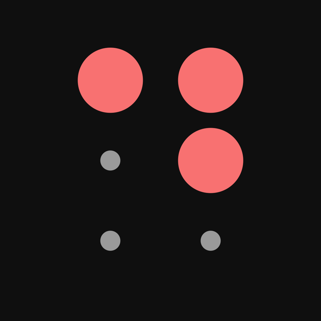
What the mark means
Three red dots in the upper-right of a 2×3 grid is the Braille cell for the letter D. Pick it up in muscle memory: top-left dot, top-right dot, middle-right dot.
The three small ink dots at the empty positions are not decoration — they're the anchor points that make the cell read as a cell. Without them, the red dots float; with them, the Braille structure is preserved at any size.
Braille gives us a mark that is both legible (it's a letter) and quietly meaningful (it's the alphabet of disability literacy). It scales from 16-pixel browser tabs to 10-foot conference banners without losing what it says.